Series - Feedback
Images
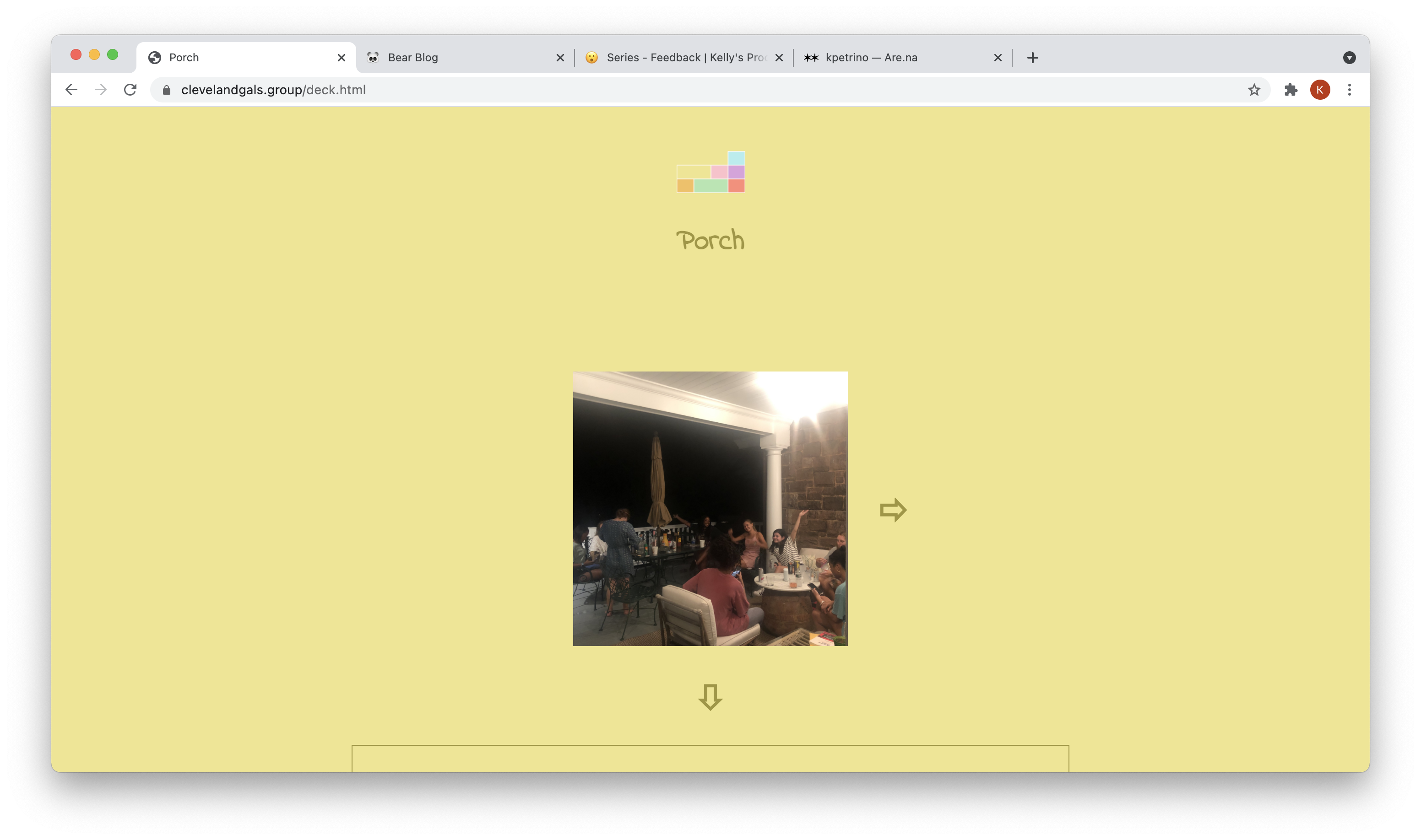
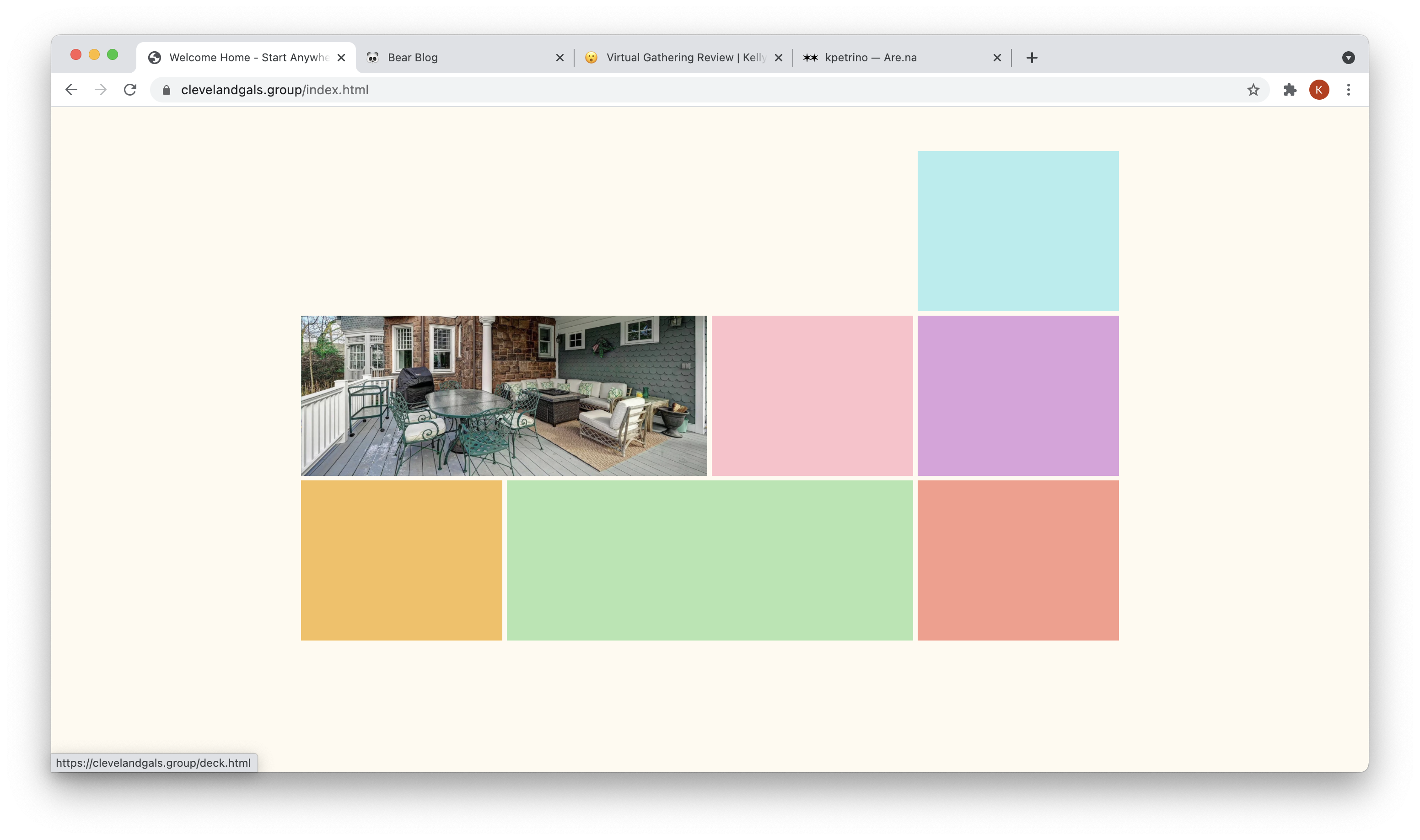
I really liked the suggestion to make the homepage boxes switch to the more stock like photos of the house. I also thought that the criticism of using those staged photos on the actual pages felt inauthentic to the stories being told. So I switched out the photos on the pages to images of us in the house (or it being more lived in). I think this switch aligns with my goal of making it feel like you've been invited into the house to hang out with us by navigating the pages and readings the stories.
Font
I switched out the font after seeing other's presentations. I felt like this new font looked more like handwriting and gave a better feeling of homeyness and storytelling.
Navigation
I added in arrows to go from the yellow to the pink box and vice-versa. While there isn't actually a door there (which is why I left it out the first time), I do think that looking at the map above and not being able to go left/right is disorienting and takes away from the navigation. I also changed the title of the homepage to include "Start Anywhere" to prompt visitors to click around on the page.